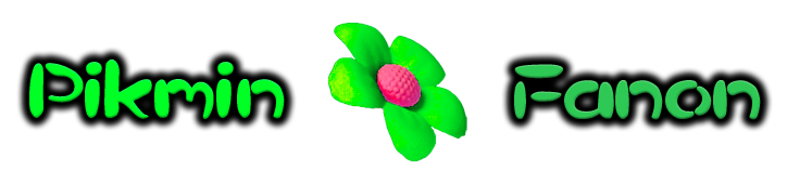
Forum:New logo proposal: Difference between revisions
From Pikmin Fanon
Gamefreak75 (talk | contribs) |
mNo edit summary |
||
| (18 intermediate revisions by 7 users not shown) | |||
| Line 1: | Line 1: | ||
{|class="wikitable" align="center" style="text-align:center" | {{forumheader|Onion Complex}} | ||
<div class="thumb tnone" style="clear: both"><div class="thumbinner"><div class="overflowbugx" style="overflow: auto"> | |||
{| class="wikitable" align="center" style="text-align: center;" | |||
|- | |- | ||
!Proposal A!!Proposal B!!Proposal C!!Proposal D!!Proposal E | !Proposal A !! Proposal B !! Proposal C !! Proposal D !! Proposal E | ||
|- | |- | ||
|[[ | |[[File:Wikilogo1.png]] || [[File:Wikilogo2.png]] || [[File:Wikilogo3.png]] || [[File:Wikilogo4.png]] || [[File:Wikilogo5.png]] | ||
|} | |} | ||
</div></div></div> | |||
==Vote== | ==Vote== | ||
Put a comment and your sig under the section to vote! | Put a comment and your sig under the section to vote! | ||
:''Once the vote has been decided, we will change the theme of the wiki to the corresponding color.'' | :''Once the vote has been decided, we will change the theme of the wiki to the corresponding color.'' | ||
===Keep [ | |||
===Keep [https://cdn.pikminfanon.com/archive/b/bc/20101027035247!Wiki.png the old logo]=== | |||
None. | |||
===[[:File:Background.png|The background logo]]=== | ===[[:File:Background.png|The background logo]]=== | ||
None. | |||
===Proposal A=== | ===Proposal A=== | ||
None. | |||
===Proposal B=== | ===Proposal B=== | ||
<s>I think that this Logo is the best because it fits the theme of the wiki and Pikmin. -[[User:Zoadra|Peanut64]] ([[User talk:Zoadra|talk]])</s> | |||
#Hmm....I'm a bit torn! I like the old logo because it's completely different from Pikipedia's logo, but...this one does fit the theme of the wiki, so I guess I'll choose this one. [[User:Dany36|Dany36]] 11:33, 30 October 2010 (EDT) | |||
===Proposal C=== | ===Proposal C=== | ||
#I like this one best. Option B is good because it properly represents the series' theme, but this one also stands out more. {{User:Portal-Kombat/sig}} | |||
#I must say PK totally just sold me on his "stands out more bit". :) {{User:Zoadra/sig}} | |||
===Proposal D=== | ===Proposal D=== | ||
Tied between this one and C, but it is blue, my favorite color. :) | #Tied between this one and C, but it is blue, my favorite color. :) {{User:Gamefreak75/sig}} | ||
===Proposal E=== | ===Proposal E=== | ||
None. | |||
===Alternate Proposal (Include Image Below)=== | ===Alternate Proposal (Include Image Below)=== | ||
===Alternate 1=== | |||
#Hmm, I'm not really a fan of the font used in the proposals above. Also, I kind of like the test used in the background image, as well as the cobweb image in the current logo. So here's my suggestion combining the two: | |||
[[File:PikminFanonLogoProposal Adam.jpg|left]] | |||
{{clear}} | |||
--[[User:Adam|Adam]] 07:14, 30 October 2010 (EDT) | |||
===Alternate 2=== | |||
#I was going to vote for the old logo, but I like the background image as well, and I didn't really like the fonts on the proposed logos, and then I saw Adam's idea, so, here it is: | |||
<br>[[File:Pikcanon-NOTLogoProposal Vol.png|left|This is Volatile Dweevil's idea for a new logo.]] | |||
{{clear}} | |||
{{User:Volatile Dweevil/sig}} | |||
Latest revision as of 02:41, 8 November 2023
- Forums: Index > Onion Complex > New logo proposal
| Proposal A | Proposal B | Proposal C | Proposal D | Proposal E |
|---|---|---|---|---|
 |
 |
 |
 |

|
Vote
Put a comment and your sig under the section to vote!
- Once the vote has been decided, we will change the theme of the wiki to the corresponding color.
Keep the old logo
None.
The background logo
None.
Proposal A
None.
Proposal B
I think that this Logo is the best because it fits the theme of the wiki and Pikmin. -Peanut64 (talk)
- Hmm....I'm a bit torn! I like the old logo because it's completely different from Pikipedia's logo, but...this one does fit the theme of the wiki, so I guess I'll choose this one. Dany36 11:33, 30 October 2010 (EDT)
Proposal C
- I like this one best. Option B is good because it properly represents the series' theme, but this one also stands out more. Portal-Kombat *Sysop*
- I must say PK totally just sold me on his "stands out more bit". :) Zoadra
 Admin, Bureaucrat
Proposal D
Proposal E
None.
Alternate Proposal (Include Image Below)
Alternate 1
- Hmm, I'm not really a fan of the font used in the proposals above. Also, I kind of like the test used in the background image, as well as the cobweb image in the current logo. So here's my suggestion combining the two:

--Adam 07:14, 30 October 2010 (EDT)
Alternate 2
- I was going to vote for the old logo, but I like the background image as well, and I didn't really like the fonts on the proposed logos, and then I saw Adam's idea, so, here it is:

![]()
![]()