Forum:New logo proposal: Difference between revisions
From Pikmin Fanon
m (Text replacement - "User:Wraith/sig" to "User:Zoadra/sig") |
mNo edit summary |
||
| Line 25: | Line 25: | ||
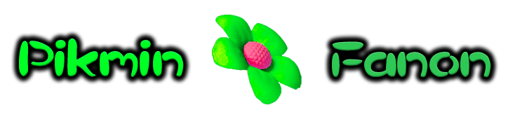
===Proposal B=== | ===Proposal B=== | ||
<s>I think that this Logo is the best because it fits the theme of the wiki and Pikmin. -[[User: | <s>I think that this Logo is the best because it fits the theme of the wiki and Pikmin. -[[User:Zoadra|Peanut64]] ([[User talk:Zoadra|talk]])</s> | ||
#Hmm....I'm a bit torn! I like the old logo because it's completely different from Pikipedia's logo, but...this one does fit the theme of the wiki, so I guess I'll choose this one. [[User:Dany36|Dany36]] 11:33, 30 October 2010 (EDT) | #Hmm....I'm a bit torn! I like the old logo because it's completely different from Pikipedia's logo, but...this one does fit the theme of the wiki, so I guess I'll choose this one. [[User:Dany36|Dany36]] 11:33, 30 October 2010 (EDT) | ||
Latest revision as of 02:41, 8 November 2023
- Forums: Index > Onion Complex > New logo proposal
| Proposal A | Proposal B | Proposal C | Proposal D | Proposal E |
|---|---|---|---|---|
 |
 |
 |
 |

|
Vote
Put a comment and your sig under the section to vote!
- Once the vote has been decided, we will change the theme of the wiki to the corresponding color.
Keep the old logo
None.
The background logo
None.
Proposal A
None.
Proposal B
I think that this Logo is the best because it fits the theme of the wiki and Pikmin. -Peanut64 (talk)
- Hmm....I'm a bit torn! I like the old logo because it's completely different from Pikipedia's logo, but...this one does fit the theme of the wiki, so I guess I'll choose this one. Dany36 11:33, 30 October 2010 (EDT)
Proposal C
- I like this one best. Option B is good because it properly represents the series' theme, but this one also stands out more. Portal-Kombat *Sysop*
- I must say PK totally just sold me on his "stands out more bit". :) Zoadra
 Admin, Bureaucrat
Proposal D
Proposal E
None.
Alternate Proposal (Include Image Below)
Alternate 1
- Hmm, I'm not really a fan of the font used in the proposals above. Also, I kind of like the test used in the background image, as well as the cobweb image in the current logo. So here's my suggestion combining the two:

--Adam 07:14, 30 October 2010 (EDT)
Alternate 2
- I was going to vote for the old logo, but I like the background image as well, and I didn't really like the fonts on the proposed logos, and then I saw Adam's idea, so, here it is:

![]()
![]()